Image · Figma 2:2612
Cover: Don't Close Yet content area (2:2612), or a SmartCredit + Hogo composite
ConsumerDirect
UI/UX design internship across SmartCredit and Hogo
My Role
UI/UX Design Intern, ConsumerDirect
Team
Product Team & Developers
Timeline
June - September 2026
The company
ConsumerDirect is an fintech company that builds tools to help people take charge of their credit, finances, and privacy. At ConsumerDirect, I worked alongside designers, product leads, developers, and stakeholders to improve user experiences across their two biggest products: SmartCredit and Hogo.
SmartCredit
Helps members understand what drives their credit score and act on it, with tools like ScoreBuilder and Money Manager alongside credit monitoring.
Jump to Cancellation flow redesign
Hogo
A gamified privacy app for members who already have good credit and want to protect it. Data broker removal, dark web monitoring, and fraud protection, with rewards for securing their data.
jump to Onboarding tour
Redesigning SmartCredit's cancellation flow
SmartCredit's close wizard was meant to give members one last reason to stay. Over time it grew into 5+ screens with 3 branching paths. What a member saw depended on the reason they picked for leaving, so many of them never reached the features most likely to keep them. To improve the experience and align with FTC click-to-cancel guidance, we needed fewer screens, without losing the parts that actually kept members. In addition, I gave the cancellation flow screens a visual overhaul to match Smartcredit's current design direction.

original close wizard flow


original close wizard Screens
Adjusting the flow based on retention data
In the original flow, retention offers were gated by the cancellation reason a member selected. Someone who chose “technical reasons” never saw the Essential plan offer, and someone who chose a different reason might never see their personalized value recap. Nothing about either reason meant those offers wouldn’t help, so a member’s single dropdown choice was deciding which offers they ever saw. I removed that dependency and ordered the experience by what retention data showed actually kept members.

Leading with personalized value recap and customer support
Retention data showed the personalized action list led to the most saves, so it leads the screen. Within the list, some actions outperformed others. Showing members how many points their account could still gain had the highest retention, so those high-impact actions are ranked first. Support data showed that members who called in were more likely to keep their membership, so the banner is now visible to every member at this step instead of depending on a specific cancellation reason.

Rethinking the final screen
Asking for a cancellation reason up front made members commit to leaving before they’d seen what they would lose. I moved feedback to the final step, after the value recap and support options, and placed the Essential Plan offer right beside it. Every member now sees the offer, regardless of their reason, at the moment of decision.


Outcome
5 → 2
steps to cancel
Shipped
The new screens are currently in production. We shop[ to measure success by observing more members keep their account or switch plans instead of cancelling their membership.
Hogo Onboarding Tour
Hogo had no guidance for people who had just signed up. New users landed in the app with no explanation of how its core features worked. I designed a guided onboarding tour that walks new users through the app step by step. It introduces the key features in context, so users get comfortable quickly and see everything Hogo can do for them from day one.
onboarding tour in motion
Design Process
I went into this project with the goal to get new users to understand Hogo's core value within their first session. My approach was a guided tour because discoverability of features was Hogo's biggest issue. New users couldn’t tell how the app’s core features fit together. I chose a guided tour, which lets me introduce the core features in a deliberate order that follows the app’s core loop.
The Core Loop
The tour is ordered around Hogo’s core loop, so each step sets up the next.
Step 01
Privacy
Hogo finds where your personal info is exposed online and lists every site.
Step 02
Swipe to remove & earn coins
Swipe left to remove your info from a site. Every removal earns Hogo Coins.
Step 03
Rewards
Spend coins on gift cards, charities and more.
↻ Earned coins bring users back to Privacy to remove more, which closes the loop.
Why Fraud Insurance Made the Cut
Fraud insurance sits outside the core loop, but I kept it in the tour. It’s free for every Hogo user, yet data showed most users never activated it. That’s a discoverability problem, which is exactly what the tour is meant to solve.

1 · Start

2 · Helper home

4 · Privacy

5 · Data removal
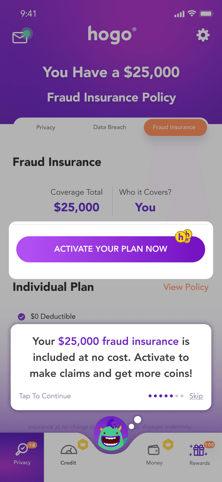
6 · Fraud

7 · Rewards

9 · Call to action

10 · Drop-off
Freemium Tooltips
I kept money and credit features out of the tour because they’re for paid users, and the tour was built for everyone. Instead, when a free user opens one, a tooltip explains what it does and offers a 14-day PRO trial.

Credit · Report

Credit · Tracker

Credit · Builder

Credit · Boost

Privacy · Data breaches

Money · Summary

Money · Assets
